🔗 Live Website: seatlas
After finishing my KCET exams, college searching somehow became more stressful than the exam itself.
Every single college search meant opening multiple tabs just to answer basic questions:
- Can I realistically get this college with my rank and 2A reservation?
- How far is it from my home?
- What are the placements and ROI like?
- What branches can I get?
- How long would daily travel take?
The whole process felt fragmented and frustrating.
So I built Seatlas.
The idea started very simply:
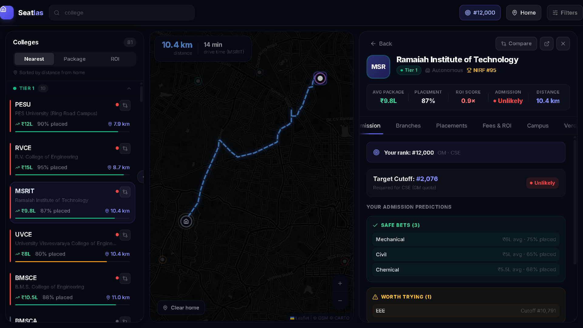
put colleges directly on a map and make every important detail accessible in one click.
I used Claude inside Antigravity to help kickstart the project, and it genuinely made the whole building process much easier. From there, I kept iterating, testing, redesigning, and improving the experience until it actually felt useful.
Seatlas lets users explore colleges visually through a map-based interface while checking:
- cutoffs
- reservation-based chances
- placements and ROI
- travel distance and commute
- branch details
- public transport access
- overall college insights
Instead of jumping across 10 websites, the goal was to make college searching feel simple, intuitive, and less overwhelming.
I later deployed it on Vercel and shared it through Instagram, Reddit, and X, where it crossed 1000+ organic views.
More than anything, this project taught me how powerful software can feel when it solves a problem you personally struggled with.