feat(button): Eva style - #1359
Merged
Merged
Conversation


BREAKING CHANGE:

NbButtonComponent.

'accent' property removed.

Static properties removed. Removed properties:
SIZE_XSMALL, SIZE_SMALL, SIZE_MEDIUM, SIZE_LARGE, STATUS_PRIMARY,
STATUS_INFO, STATUS_SUCCESS, STATUS_WARNING, STATUS_DANGER,
SHAPE_RECTANGLE, SHAPE_ROUND, SHAPE_SEMI_ROUND.
Use NbComponentSize, NbComponentStatus, NbComponentShape.

Size classes were renamed:
btn-xsmall -> size-tiny
btn-small -> size-small
btn-medium -> size-medium
btn-large -> size-large

Size getter 'xsmall' renamed to tiny.

Status classes were renamed:
btn-primary -> status-primary
btn-info -> status-info
btn-success -> status-success
btn-warning -> status-warning
btn-danger -> status-danger

Shape classes were renamed:
btn-rectangle -> shape-rectangle
btn-round -> shape-round
btn-semi-round -> shape-semi-round
BREAKING CHANGE:
'btn-outline' class renamed to 'appearance-outline'.
'btn-hero' class renamed to 'appearance-hero'.
BREAKING CHANGE:

Button theme properties prefix changed to 'button' (was 'btn').

Following theme properties were renamed:
btn-fg -> button-filled-[status]-text-color,
          button-outline-[status]-[state?]-text-color,
          button-ghost-[status]-[state?]-text-color,
          button-hero-[status]-text-color
btn-font-family -> button-text-font-family
btn-line-height -> button-[size]-text-line-height
btn-cursor -> button-cursor
btn-[status]-bg -> button-filled-[status]-background-color
btn-[status]-hover-bg -> button-filled-[status]-hover-background-color
btn-[status]-active-bg -> button-filled-[status]-active-background-color
btn-padding-y-[size], btn-padding-x-[size] -> button-[appearance]-[size]-padding
btn-font-size-[size] -> button-[size]-text-font-size
btn-rectangle-border-radius -> button-rectangle-border-radius
btn-semi-round-border-radius -> button-semi-round-border-radius
btn-round-border-radius -> button-round-border-radius
btn-hero-shadow -> button-hero-shadow
btn-hero-text-shadow -> button-hero-text-shadow
btn-hero-bevel-size -> button-hero-bevel-size
btn-hero-glow-size -> button-hero-glow-size
btn-hero-[status]-bevel-color -> button-hero-[status]-bevel-color
btn-hero-[status]-glow-color -> button-hero-[status]-glow-color
btn-hero-[status]-left-bg -> button-hero-[status]-left-background-color
btn-hero-[status]-right-bg -> button-hero-[status]-right-background-color
btn-hero-[status]-left-hover-bg -> button-hero-[status]-hover-left-background-color
btn-hero-[status]-right-hover-bg -> button-hero-[status]-hover-right-background-color
btn-hero-[status]-left-active-bg -> button-hero-[status]-active-left-background-color
btn-hero-[status]-right-active-bg -> button-hero-[status]-active-right-background-color
btn-outline-fg -> button-outline-[status]-border-color
btn-outline-hover-fg -> button-outline-[status]-hover-border-color
btn-outline-focus-fg -> button-outline-[status]-focus-border-color

Following theme properties were removed:
btn-group-bg
btn-group-fg
btn-group-separator
btn-disabled-opacity
btn-secondary-bg
btn-secondary-hover-bg
btn-secondary-active-bg
btn-secondary-border
btn-secondary-border-width
btn-hero-secondary-bevel-color
btn-hero-secondary-glow-color
btn-hero-border-radius

BREAKING CHANGE:

'btn-pulse' status renamed to 'button-pulse'.
yggg
marked this pull request as ready for review
April 8, 2019 11:05
BREAKING CHANGE:
'btn-full-width' renamed to 'full-width'.

Codecov Report
@@            Coverage Diff             @@
##             next    #1359      +/-   ##
==========================================
- Coverage   81.85%   81.81%   -0.04%
==========================================
  Files         237      237
  Lines        7230     7238       +8
  Branches      628      632       +4
==========================================
+ Hits         5918     5922       +4
- Misses       1124     1128       +4
  Partials      188      188
|

nnixaa
requested changes
Apr 9, 2019
 nnixaa
left a comment
nnixaa
left a comment
nnixaa
left a comment
Collaborator
There was a problem hiding this comment.
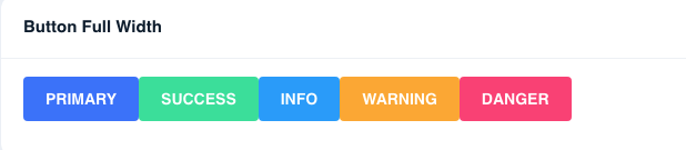
full width doesn't seem to work

Contributor
Author
Fixed 28cd421 |
nnixaa
approved these changes
Apr 9, 2019
yggg
added a commit
that referenced
this pull request
Apr 17, 2019
BREAKING CHANGE:

'accent' property removed.

Static properties removed. Removed properties:
SIZE_XSMALL, SIZE_SMALL, SIZE_MEDIUM, SIZE_LARGE, STATUS_PRIMARY,
STATUS_INFO, STATUS_SUCCESS, STATUS_WARNING, STATUS_DANGER,
SHAPE_RECTANGLE, SHAPE_ROUND, SHAPE_SEMI_ROUND.
Use NbComponentSize, NbComponentStatus, NbComponentShape.

Size classes were renamed:
btn-xsmall -> size-tiny
btn-small -> size-small
btn-medium -> size-medium
btn-large -> size-large

Size getter 'xsmall' renamed to tiny.

Status classes were renamed:
btn-primary -> status-primary
btn-info -> status-info
btn-success -> status-success
btn-warning -> status-warning
btn-danger -> status-danger

Shape classes were renamed:
btn-rectangle -> shape-rectangle
btn-round -> shape-round
btn-semi-round -> shape-semi-round

'btn-outline' class renamed to 'appearance-outline'.
'btn-hero' class renamed to 'appearance-hero'.

Button theme properties prefix changed to 'button' (was 'btn').

Following theme properties were renamed:
btn-fg -> button-filled-[status]-text-color,
button-outline-[status]-[state?]-text-color,
button-ghost-[status]-[state?]-text-color,
button-hero-[status]-text-color
btn-font-family -> button-text-font-family
btn-line-height -> button-[size]-text-line-height
btn-cursor -> button-cursor
btn-[status]-bg -> button-filled-[status]-background-color
btn-[status]-hover-bg -> button-filled-[status]-hover-background-color
btn-[status]-active-bg -> button-filled-[status]-active-background-color
btn-padding-y-[size], btn-padding-x-[size] -> button-[appearance]-[size]-padding
btn-font-size-[size] -> button-[size]-text-font-size
btn-rectangle-border-radius -> button-rectangle-border-radius
btn-semi-round-border-radius -> button-semi-round-border-radius
btn-round-border-radius -> button-round-border-radius
btn-hero-shadow -> button-hero-shadow
btn-hero-text-shadow -> button-hero-text-shadow
btn-hero-bevel-size -> button-hero-bevel-size
btn-hero-glow-size -> button-hero-glow-size
btn-hero-[status]-bevel-color -> button-hero-[status]-bevel-color
btn-hero-[status]-glow-color -> button-hero-[status]-glow-color
btn-hero-[status]-left-bg -> button-hero-[status]-left-background-color
btn-hero-[status]-right-bg -> button-hero-[status]-right-background-color
btn-hero-[status]-left-hover-bg -> button-hero-[status]-hover-left-background-color
btn-hero-[status]-right-hover-bg -> button-hero-[status]-hover-right-background-color
btn-hero-[status]-left-active-bg -> button-hero-[status]-active-left-background-color
btn-hero-[status]-right-active-bg -> button-hero-[status]-active-right-background-color
btn-outline-fg -> button-outline-[status]-border-color
btn-outline-hover-fg -> button-outline-[status]-hover-border-color
btn-outline-focus-fg -> button-outline-[status]-focus-border-color

Following theme properties were removed:
btn-group-bg
btn-group-fg
btn-group-separator
btn-disabled-opacity
btn-secondary-bg
btn-secondary-hover-bg
btn-secondary-active-bg
btn-secondary-border
btn-secondary-border-width
btn-hero-secondary-bevel-color
btn-hero-secondary-glow-color
btn-hero-border-radius

'btn-pulse' status renamed to 'button-pulse'.

'btn-full-width' renamed to 'full-width'.
yggg
added a commit
that referenced
this pull request
May 27, 2019
BREAKING CHANGE:

'accent' property removed.

Static properties removed. Removed properties:
SIZE_XSMALL, SIZE_SMALL, SIZE_MEDIUM, SIZE_LARGE, STATUS_PRIMARY,
STATUS_INFO, STATUS_SUCCESS, STATUS_WARNING, STATUS_DANGER,
SHAPE_RECTANGLE, SHAPE_ROUND, SHAPE_SEMI_ROUND.
Use NbComponentSize, NbComponentStatus, NbComponentShape.

Size classes were renamed:
btn-xsmall -> size-tiny
btn-small -> size-small
btn-medium -> size-medium
btn-large -> size-large

Size getter 'xsmall' renamed to tiny.

Status classes were renamed:
btn-primary -> status-primary
btn-info -> status-info
btn-success -> status-success
btn-warning -> status-warning
btn-danger -> status-danger

Shape classes were renamed:
btn-rectangle -> shape-rectangle
btn-round -> shape-round
btn-semi-round -> shape-semi-round

'btn-outline' class renamed to 'appearance-outline'.
'btn-hero' class renamed to 'appearance-hero'.

Button theme properties prefix changed to 'button' (was 'btn').

Following theme properties were renamed:
btn-fg -> button-filled-[status]-text-color,
button-outline-[status]-[state?]-text-color,
button-ghost-[status]-[state?]-text-color,
button-hero-[status]-text-color
btn-font-family -> button-text-font-family
btn-line-height -> button-[size]-text-line-height
btn-cursor -> button-cursor
btn-[status]-bg -> button-filled-[status]-background-color
btn-[status]-hover-bg -> button-filled-[status]-hover-background-color
btn-[status]-active-bg -> button-filled-[status]-active-background-color
btn-padding-y-[size], btn-padding-x-[size] -> button-[appearance]-[size]-padding
btn-font-size-[size] -> button-[size]-text-font-size
btn-rectangle-border-radius -> button-rectangle-border-radius
btn-semi-round-border-radius -> button-semi-round-border-radius
btn-round-border-radius -> button-round-border-radius
btn-hero-shadow -> button-hero-shadow
btn-hero-text-shadow -> button-hero-text-shadow
btn-hero-bevel-size -> button-hero-bevel-size
btn-hero-glow-size -> button-hero-glow-size
btn-hero-[status]-bevel-color -> button-hero-[status]-bevel-color
btn-hero-[status]-glow-color -> button-hero-[status]-glow-color
btn-hero-[status]-left-bg -> button-hero-[status]-left-background-color
btn-hero-[status]-right-bg -> button-hero-[status]-right-background-color
btn-hero-[status]-left-hover-bg -> button-hero-[status]-hover-left-background-color
btn-hero-[status]-right-hover-bg -> button-hero-[status]-hover-right-background-color
btn-hero-[status]-left-active-bg -> button-hero-[status]-active-left-background-color
btn-hero-[status]-right-active-bg -> button-hero-[status]-active-right-background-color
btn-outline-fg -> button-outline-[status]-border-color
btn-outline-hover-fg -> button-outline-[status]-hover-border-color
btn-outline-focus-fg -> button-outline-[status]-focus-border-color

Following theme properties were removed:
btn-group-bg
btn-group-fg
btn-group-separator
btn-disabled-opacity
btn-secondary-bg
btn-secondary-hover-bg
btn-secondary-active-bg
btn-secondary-border
btn-secondary-border-width
btn-hero-secondary-bevel-color
btn-hero-secondary-glow-color
btn-hero-border-radius

'btn-pulse' status renamed to 'button-pulse'.

'btn-full-width' renamed to 'full-width'.
This file contains hidden or bidirectional Unicode text that may be interpreted or compiled differently than what appears below. To review, open the file in an editor that reveals hidden Unicode characters.
Learn more about bidirectional Unicode characters
Sign up for free
to join this conversation on GitHub.
Already have an account?
Sign in to comment
2 participants


Add this suggestion to a batch that can be applied as a single commit.This suggestion is invalid because no changes were made to the code.Suggestions cannot be applied while the pull request is closed.Suggestions cannot be applied while viewing a subset of changes.Only one suggestion per line can be applied in a batch.Add this suggestion to a batch that can be applied as a single commit.Applying suggestions on deleted lines is not supported.You must change the existing code in this line in order to create a valid suggestion.Outdated suggestions cannot be applied.This suggestion has been applied or marked resolved.Suggestions cannot be applied from pending reviews.Suggestions cannot be applied on multi-line comments.Suggestions cannot be applied while the pull request is queued to merge.Suggestion cannot be applied right now. Please check back later.
Please read and mark the following check list before creating a pull request:
Short description of what this resolves:
BREAKING CHANGE:
'accent' property removed.
Static properties removed. Removed properties:
SIZE_XSMALL, SIZE_SMALL, SIZE_MEDIUM, SIZE_LARGE, STATUS_PRIMARY,
STATUS_INFO, STATUS_SUCCESS, STATUS_WARNING, STATUS_DANGER,
SHAPE_RECTANGLE, SHAPE_ROUND, SHAPE_SEMI_ROUND.
Use NbComponentSize, NbComponentStatus, NbComponentShape.
Size classes were renamed:
btn-xsmall -> size-tiny
btn-small -> size-small
btn-medium -> size-medium
btn-large -> size-large
Size getter 'xsmall' renamed to tiny.
Status classes were renamed:
btn-primary -> status-primary
btn-info -> status-info
btn-success -> status-success
btn-warning -> status-warning
btn-danger -> status-danger
Shape classes were renamed:
btn-rectangle -> shape-rectangle
btn-round -> shape-round
btn-semi-round -> shape-semi-round
'btn-outline' class renamed to 'appearance-outline'.
'btn-hero' class renamed to 'appearance-hero'.
Button theme properties prefix changed to 'button' (was 'btn').
Following theme properties were renamed:
btn-fg -> button-filled-[status]-text-color,
button-outline-[status]-[state?]-text-color,
button-ghost-[status]-[state?]-text-color,
button-hero-[status]-text-color
btn-font-family -> button-text-font-family
btn-line-height -> button-[size]-text-line-height
btn-cursor -> button-cursor
btn-[status]-bg -> button-filled-[status]-background-color
btn-[status]-hover-bg -> button-filled-[status]-hover-background-color
btn-[status]-active-bg -> button-filled-[status]-active-background-color
btn-padding-y-[size], btn-padding-x-[size] -> button-[appearance]-[size]-padding
btn-font-size-[size] -> button-[size]-text-font-size
btn-rectangle-border-radius -> button-rectangle-border-radius
btn-semi-round-border-radius -> button-semi-round-border-radius
btn-round-border-radius -> button-round-border-radius
btn-hero-shadow -> button-hero-shadow
btn-hero-text-shadow -> button-hero-text-shadow
btn-hero-bevel-size -> button-hero-bevel-size
btn-hero-glow-size -> button-hero-glow-size
btn-hero-[status]-bevel-color -> button-hero-[status]-bevel-color
btn-hero-[status]-glow-color -> button-hero-[status]-glow-color
btn-hero-[status]-left-bg -> button-hero-[status]-left-background-color
btn-hero-[status]-right-bg -> button-hero-[status]-right-background-color
btn-hero-[status]-left-hover-bg -> button-hero-[status]-hover-left-background-color
btn-hero-[status]-right-hover-bg -> button-hero-[status]-hover-right-background-color
btn-hero-[status]-left-active-bg -> button-hero-[status]-active-left-background-color
btn-hero-[status]-right-active-bg -> button-hero-[status]-active-right-background-color
btn-outline-fg -> button-outline-[status]-border-color
btn-outline-hover-fg -> button-outline-[status]-hover-border-color
btn-outline-focus-fg -> button-outline-[status]-focus-border-color
Following theme properties were removed:
btn-group-bg
btn-group-fg
btn-group-separator
btn-disabled-opacity
btn-secondary-bg
btn-secondary-hover-bg
btn-secondary-active-bg
btn-secondary-border
btn-secondary-border-width
btn-hero-secondary-bevel-color
btn-hero-secondary-glow-color
btn-hero-border-radius
'btn-pulse' status renamed to 'button-pulse'.
'btn-full-width' renamed to 'full-width'.